Dashboard map for 2022 SDG Index Goal #10 ratings. Data source: sdgindex.org
Gini coefficient
The most well-known measure of income inequality is the Gini coefficient, developed by Corrado Gini, an Italian statistician. 'Coefficient’ may harken to high school maths in a way you’d prefer to repress - if so, we can consider the Gini coefficient to be a score, like the SDG Index scores. A Gini coefficient of 0 would mean perfect equality i.e., everyone in the country has an identical amount of income. A Gini coefficient of 100, by contrast, would mean the entire income of a country was in the hands of one person, to the exclusion of all others. For this indicator, the lower the Gini coefficient, the better. The aim by 2030 for this indicator is a Gini coefficient of 27.5, rather than aiming for full equality, which by 2030, seems utopian. To give a sense of what 27.5 looks like, and how healthy a society it results in, think of Norway, which had already achieved this indicator in 2015, with a 2018 Gini coefficient of 27.6, compared with the US’ Gini score of 41.4 in 2018.
Inequality’s effects can be insidious, corroding society in imperceptible ways. The example of the Nordic countries displays what a model country can be, with Gini scores between 27 and 30. Nordic countries are prosperous, and egalitarian by cultural norms of the ‘law of Jante’, which dissuades self-aggrandisement and non-conformity. Attitudes toward equality between and within cultures often vary. Some political philosophies infusing the mainstream or its fringes hold inequality to be natural or desirable, an outcome of evolutionary survival of the fittest. Some countries' cultures reward individual success in the form of stratospheric incomes and wealth. The law of Jante, influencing the Nordic cultures, vilifies shows of wealth, or considering oneself better than others. Each country is bound by the UN Charter and the Universal Declaration of Human Rights, both affirming the dignity of all and their equality.
We can draw the answer to income inequality from a hint given in the last indicator of SDG #1 i.e., taxes and transfers. To best illustrate, I’ll refer readers to SDG Index co-author Jeffrey Sachs’ book The Price of Civilization. On the face of it, the book is about the ills of the US, and its failure to tax and transfer sufficient to ensure the wellbeing and cohesion of its people. Yet Sachs acknowledges in the preface the prescription is applicable to any country. The titular ‘price of civilization’ is the willingness of the citizenry to be taxed by the government, and to then transfer such tax revenue to redistribute income and wealth.
For this however, we need to both trust one another and the government, something in scarcity in America, which Sachs studies in the book. Trust and social cohesion are why the Nordic countries are so equal. In sum, however, if we’re to overcome disparities in the form of the Gini coefficient, transfer payments are our best hope.
You’re welcome to redistribute your own income as best you see fit, though my suggestion for this indicator involves the government, as calculating who is contributing to income inequality is difficult according to the Gini formula. As such, the suggestion is to contact your government to advise of your willingness to be taxed more, and for those revenues to be put toward redistributing the nation’s income and wealth in the form of transfer payments. Another alternative is making such decisions at the ballot box, voting for candidates running on platforms to remedy income inequality via higher taxation and redistribution of income.
Proposing new taxes is oft considered political suicide, the point Sachs’ Price of Civilization aims to make: if we want cohesive, prosperous societies, the price is higher taxes. If we get it right, rather than being a burden, it can be a societal boon, as it is in the Nordic countries.
Summary: Contact your government to advise of your desire for higher rates of taxation and transfers to remedy income inequality, aiming for a national Gini coefficient of 27.5 by 2030.
Palma ratio
The Palma ratio is another measure of inequality alongside the Gini coefficient, developed by Chilean economist Gabriel Palma. It is the share of income of the top 10% of disposable income, divided by the share of income of the lowest 40% of disposable income. The supposition is that the middle classes tend to represent half the population, whereas the top 10% and bottom 40% divide the balance.
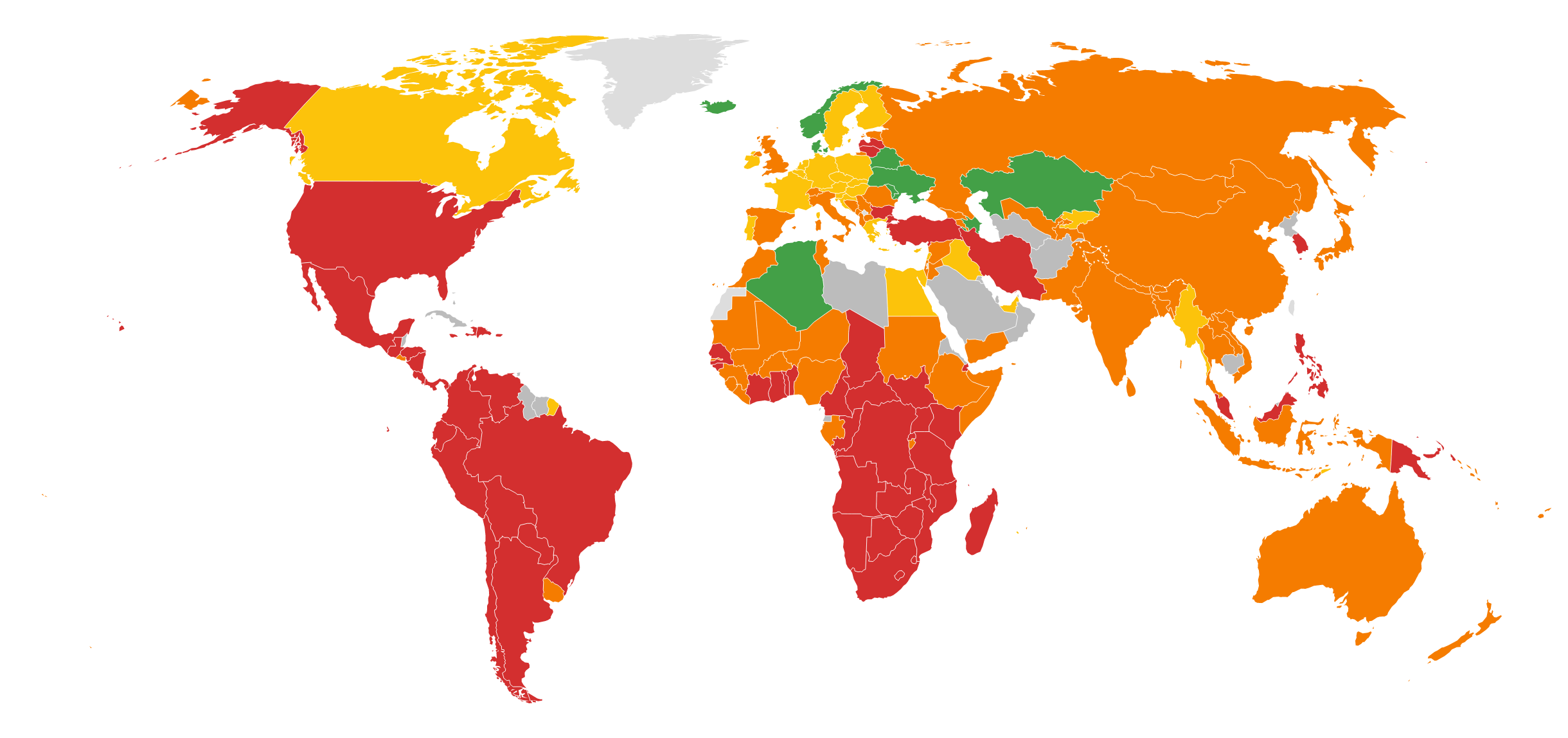
When looking at a global map for this indicator, it's clear major challenges remain. The shining lights are in many of the former communist countries in Eastern and Central Europe, as well as the Nordic countries. Other countries that have achieved this indicator are Kazakhstan, also a former communist state, and Algeria. It would appear the legacy of communism had done its job in levelling the society, though communist China scores red (so to speak) on the scores for this indicator, as do fellow communist states Vietnam and Laos.
The aim for the indicator is a Palma ratio score of 0.9. A ratio of 1 would mean the top decile and the bottom two quintiles have identical amounts of disposable income. Sweden has a Palma ratio of 1 as of 2019, whereas the US has a score of 1.81, indicating the top 10% have 81% more disposable income than the bottom 40%. Notable for a communist country, China’s Palma ratio is 3.86, more than twice that of the United States.
If you’re in the bottom 40% of your country, apply upward pressure to your circumstances, and the inverse for the top 10%. Even if it were implemented at both ends of the income distribution, there will always be a bottom 40% and a top 10%, but if both parties apply pressure toward the middle of the distribution, this would lead to a Palma ratio of the targeted 0.9.
A further suggestion for countries off-track is to seek alternatives to the top 10 companies by revenue, both in your country and worldwide. You could do the same for the business interests of the top 10 richest individuals, both in your country and worldwide.
According to the 2022 Global Fortune 500 (excluding state-owned companies), this would be:
Walmart
Amazon
Apple
Volkswagen
CVS Health
UnitedHealth
ExxonMobil
Toyota
Berkshire Hathaway
Shell
For individuals, according to Forbes in September 2022, this was:
Elon Musk (Tesla)
Bernard Arnault (LVMH)
Jeff Bezos (Amazon)
Gautam Adani (Adani)
Bill Gates (Microsoft)
Larry Ellison (Oracle)
Warren Buffet (Berkshire Hathaway)
Mukesh Ambani (Reliance)
Larry Page (Google)
Sergey Brin (Google)
If you apply this suggestion, and it had the desired effect, another business or individual would fill the top 10 spots, for which you could apply the same to them.
Summary: For readers in countries off-track:
lowest 40% of disposable income: attempt to earn more income
highest 10% of disposable income: attempt to earn less income
consider seeking alternatives to the top 10 national and global companies by revenue, as well as the businesses of the top 10 national and global richest individuals
Elderly poverty rate (% of population aged 66 and over) *
This indicator measures those aged 66 and over whose income is below half the median household income of the population for each country, aiming for an elderly poverty rate by 2030 of 3.2%.
The OECD country with the highest rate of elderly poverty is the Republic of Korea, at 43%, with the lowest being Iceland, with 3.1%, already achieving this indicator. Besides Korea, only the Baltic countries scored red among the high-income countries.
The prescription here is the same as for the above Gini coefficient i.e., tax and transfer payments. To use my own country as an example, though Australia has scored orange for this indicator in the 2022 SDG Index, the biggest expense in the Australian government budget is age pensions and income support for seniors, plus aged care services. As Peter Lindert points out in his book Making Social Spending Work, this doesn’t mean huge spending on elderly pensions is a good investment. Some countries offer poor examples of transfer payments, prioritising aged care pensions at the expense of early childhood development and primary and secondary schooling, which pay greater social dividends than aged pensions. Taxes and transfers are a solution, but it's to be weighed against other social spending, being mindful of keeping political interests out of inflated pensions in countries where this may be an issue.
Summary: For readers in countries off-track, support taxation for transfer to elderly populations, aiming to reduce the elderly poverty rate in OECD countries to 3.2% by 2030.